Emerging Issues

The challenges communities will grapple with in the future don’t typically overlap with the challenges they face right now. The world needs someone who’s looking around the corner to recognize, examine, and evaluate tomorrow’s solutions—today.

Geopolitical Shift: Corporate America's Growing Focus on Global Risk
Report
U.S. businesses operate in a world of evolving international policies and heightened geopolitical tension. Our analysis of corporate financial reports and earnings calls reveals accelerated concern.
High Stakes: A Framework for Geopolitical Risk Management
Report
This report provides a data-based assessment of how U.S. companies perceive geopolitical risk and articulates a recommended decision-making process and framework to manage such risk.
Programs
Through our incubator pilots, we source, vet, and nurture cutting-edge solutions for the problems of tomorrow.
Working in concert with other Foundation programs and business partners, we develop theories of change and test new approaches to challenges across a spectrum of disciplines, including geopolitical risk, democracy and capitalism, and business-led solutions to wicked problems.


Latest Content
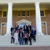
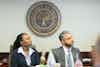
- In our annual impact report, see how we're harnessing the power of business to move from vision to real impact in communities across America and around the world.Introducing “On the Horizon,” a new series from our Innovation Scholars exploring the signals and trends shaping the future of business and society.The Judicial Fellowship Program united 25 judges from 18 countries to share strategies for judicial independence, transparency, and rule of law. Organized by the U.S. Chamber of Commerce Foundation and the Presidential Precinct, the Fellowship is building a lasting alumni network to strengthen courts, democracy, and public trust worldwide.Our Global Threats Initiative aims to mobilize whole-of-society solutions to whole-of-society problems. Senior Manager Kelsey Margey and Innovation Scholar Charlie Edwards share more insights and connect the dots from our latest research.This fall, our Judicial Fellowship Program will bring together 25 judges and magistrates from 18 countries across 6 regions of the world to Washington, D.C., and Virginia for a rigorous two-week program focused on upholding the rule of law.Fortune 250 Companies Doubled Global Risk References Since 2019, Well Before Tariff Disruptions, according to StudyU.S. businesses operate in a world of evolving international policies and heightened geopolitical tension. Our analysis of corporate financial reports and earnings calls reveals accelerated concern.This report provides a data-based assessment of how U.S. companies perceive geopolitical risk and articulates a recommended decision-making process and framework to manage such risk.In our annual impact report, you’ll see not just what we’ve accomplished, but where we’re going—and how we’re shaping a stronger, more resilient future together.